From the beginning of my exploration of Adobe InDesign, I knew I wanted to create a zine. I’ve always been drawn to the structured elegance of editorial design, yet equally attracted to the untamed creativity of vintage punk zines.
While my primary goal going into this project was to familiarize myself with utitizling grids within InDesign, I wanted to place a strong emphasis on art direction and reinforce my grasp core design principles. The result is this zine that both defines each principle and gives an example of it in action.
The Foundation
I started by defining the grids that would serve as the foundation for the layout. I’ve used modular grids heavily in the past in both Illustrator and InDesign but I specifically wanted to use a baseline grid for this project.
It would serve as the base for the vertical spacing and was set to mirror the leading of the body text. This precise alignment ensured a consistent reading experience while providing visually balanced, repeatable spacing.
I laid the ever handy 3 column modular grid overtop. I further refined it by adding rows that matched up with the baseline grid. This helped with vertical spacing while zoomed out and kind of served as secondary rule relative to the baseline grid.
Crafting the Visuals
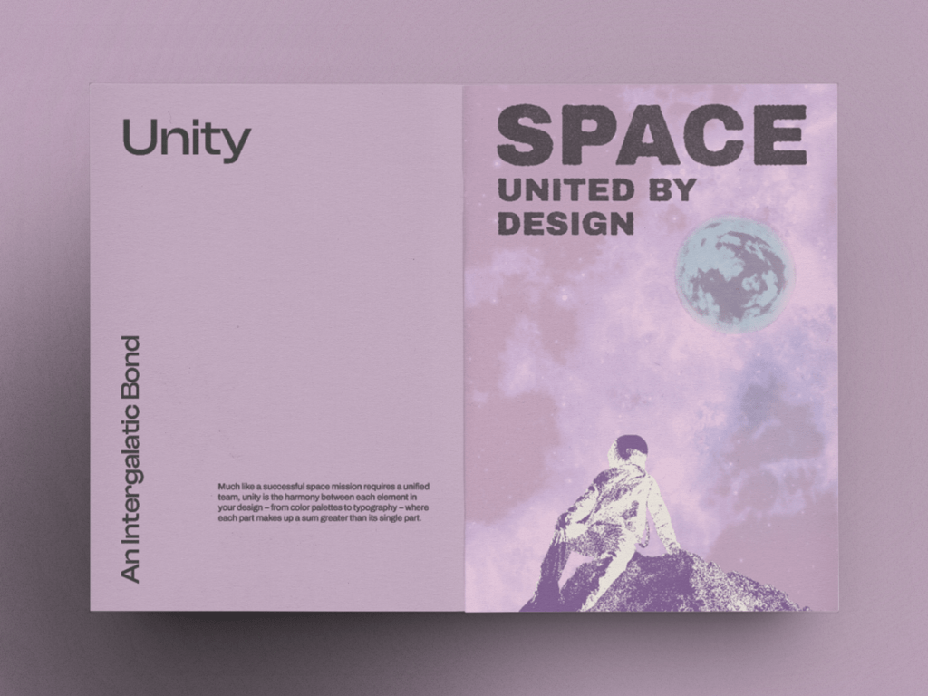
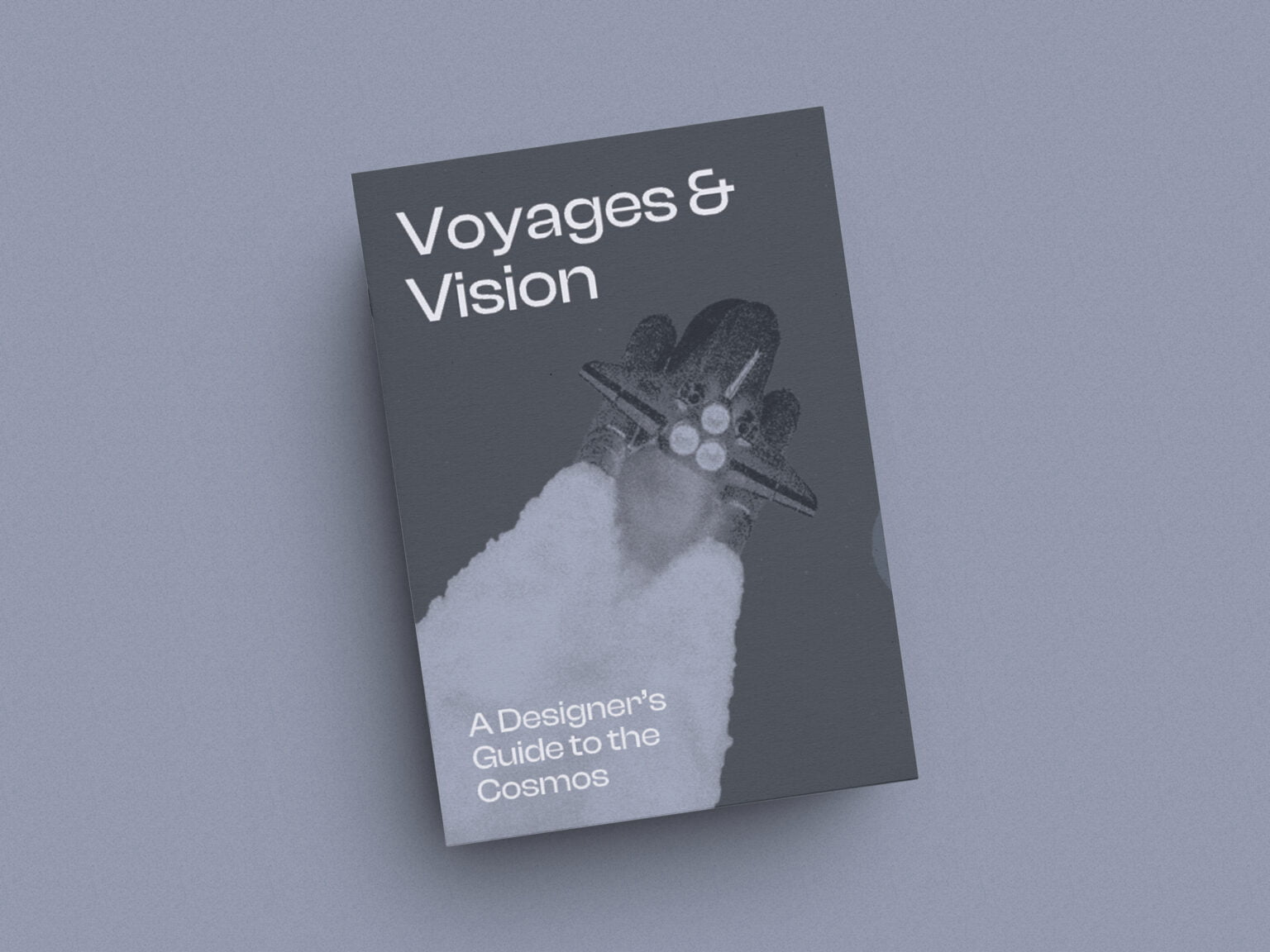
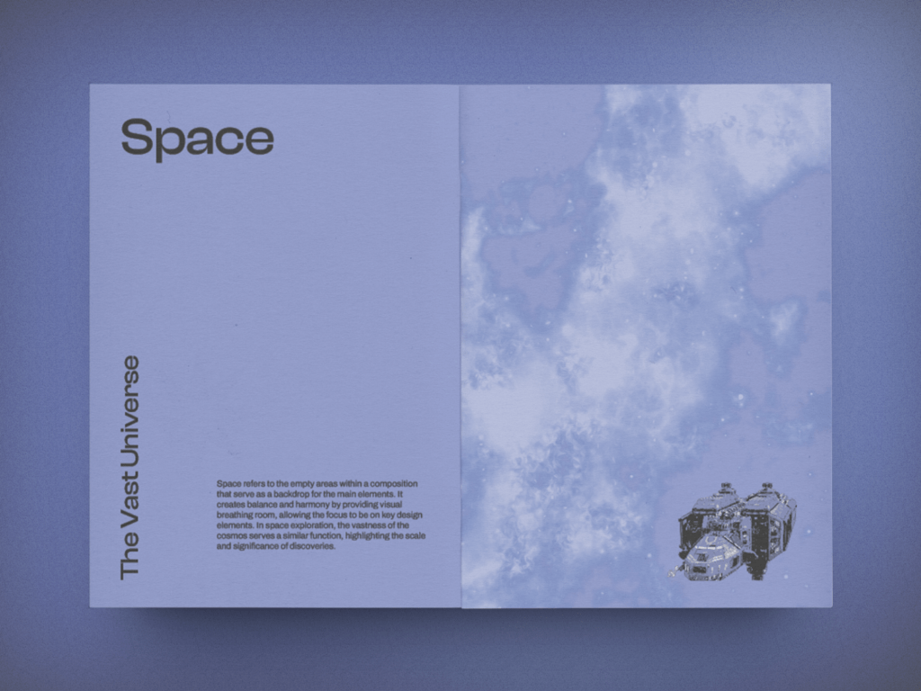
While InDesign handled the overall layout, Photoshop served as the tool for creating the visual elements. I pulled imagery from several fair-use sources and isolated the elements I wanted. Most of the coloring relied on gradient maps inside Photoshop but the layering and blending modes were applied within InDesign. This gave me more control to arrange the compositions and ensure better overall cohesion throughout the designs.
What I Learned
What started as a simple desire to play with more advanced grid techniques ended up becoming a rich learning experience. Here’s some of my key takeaways:
Grid Systems
Exploring the use of grids, particularly the baseline grid, provided a solid foundation for layout consistency and readability. Integrating modular grids allowed for flexible organization of content, contributing to a harmonious visual hierarchy.
Art Direction
Emphasizing art direction allowed me to exercise creativity in image selection, manipulation, and composition. By leveraging Photoshop’s capabilities, I enhanced the visual impact of the zine while maintaining a cohesive aesthetic.
Combining Tools
Using InDesign and Photoshop together seamlessly facilitated a dynamic workflow. Leveraging the strengths of each tool, I optimized my workflow and enabled comprehensive control over the creative process.
Cohesive Design
The synergy between layout, imagery, and typography underscored the importance of cohesive design. Consistent application of design principles contributed to a unified and engaging visual narrative.
Continued Exploration
This project served as a springboard for continued exploration and refinement of my design skills. The iterative process of experimentation and refinement fueled my passion for design and inspired a desire for continued learning.